Analytics
Zulip provides analytics for tracking various statistics about your organization to create a holistic view of its communications. All graphs are fully updated once a day, except for the Messages sent over time graph, which is updated once an hour.
Messages sent over time
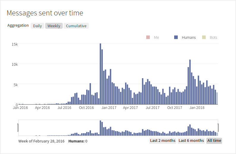
This section shows the number of messages sent by organization users over a certain period of time in a bar graph.
To view the amount of messages sent over a point of time, hover over a point on the graph to see its corresponding time period and message count displayed in the bottom left corner.
By default, messages sent by Humans (users) each week are shown in the graph.
- To change the time period that messages aggregate over, click a button next
to the Aggregation label in the top left corner.
- Selecting the Cumulative option will transform the graph into a line graph representing the total amount of messages sent over time.
- To change the types of users shown in the graph, click one of the labels in legend in the top right corner.
- To change the total timeframe of the graph, select an option in the bottom
right corner of the graph.
- You can also choose a custom timeframes by clicking and dragging the
window frame as shown below.
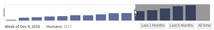
- You can also choose a custom timeframes by clicking and dragging the
window frame as shown below.
Messages sent by client
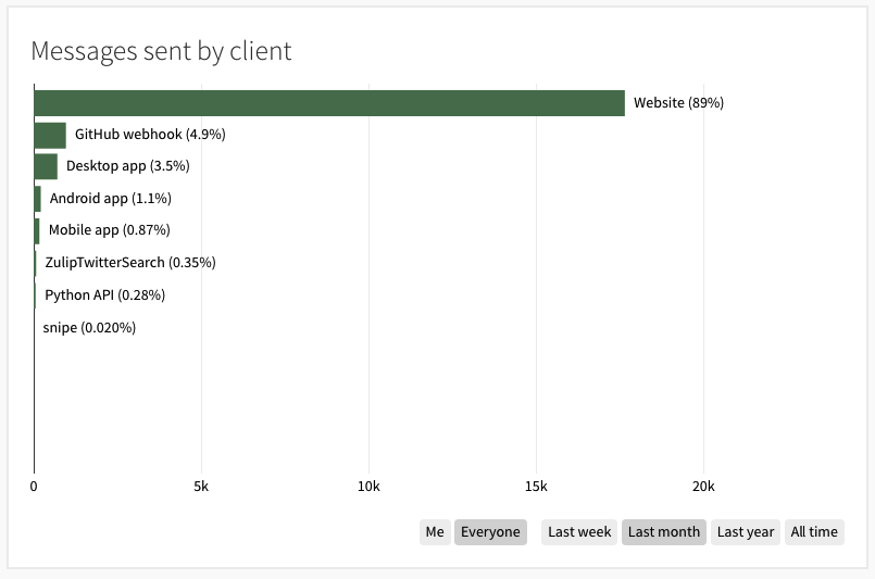
This section shows the percentage of messages sent by organization users across each client (platform) over a recent time period in a bar graph.
By default, messages sent by everyone (all users in the organization) over the past month are shown in the graph.
- To change the time period of the messages shown in the graph, click one of the options in the second group of buttons in the bottom right corner.
- Click the Me option in the first group of buttons in the bottom right corner to see the percentage of messages you sent with each client.
Messages sent by recipient type
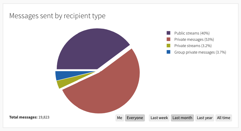
This section shows the percentages of messages sent by organization users over a recent period of time according to their recipient types (public or private; streams, individuals, or groups) in a pie chart.
The legend in the top right corner shows the percentages of each message recipient type; to see the specific amount of messages sent by a recipient type, hover over the type's portion of the pie chart.
By default, messages sent by everyone (all users in the organization) over the past month are displayed in the graph.
- To change the time period of the messages shown in the graph, click one of the options in the second group of buttons in the bottom right corner. The total amount of messages sent over time is shown in the bottom left corner.
- Click the Me option in the first group of buttons in the bottom right corner to see the percentage of messages you sent with each client.
Active users
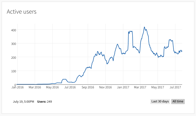
This section shows the amount of active users (users that logged on at least once within a day) across a certain period of time in a line graph. Each point on the graph represents the active user count for a day.
To view the amount of active users on a day, hover over a point on the graph to see its corresponding date and active user count displayed in the bottom left corner.
By default, the amount of active users since the creation of the organization (All time) is displayed on the graph. You can view the amount of active users within the last month by clicking the Last 30 days button to the left of the All time button in the bottom right corner.